Packaging cartons collapsed into sheets line the lofts in our apartment—set aside for that dreaded day when we’ll eventually have to move out. Little nooks and corners stare at me. Some of the empty spaces immediately scream at us, “Look at how much space is wasted!”
Living in a rented apartment, we have little control over what modifications we can make. Certainly, with the way rents are rising, we wouldn’t spend our money revamping someone else’s home! But that doesn’t stop us from dreaming.
We snap pictures of ideas we like and save Instagram posts related to sustainable home improvement. Whether we’ll ever use them is anybody’s guess!
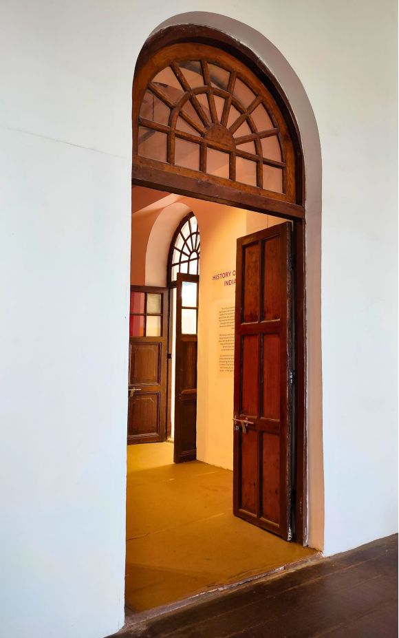
The Samatva pavilion at the India Art Architecture and Design Biennale 2023 was one such inspirational visual feast. On the outside, the pavilion was a stony medieval building. The entrances to the rooms within seemed to have been renovated in colonial-style arched doorways. But the exhibits within had a warm, welcoming feel.
Of the entire exhibition, spanning 7 pavilions, Samatva was the one that was the most intentionally designed, explaining to the layperson what the terms mean.
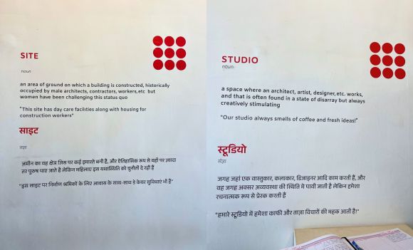
Site: an area of ground on which a building is constructed, historically occupied by male architects, contractors, workers, etc. but women have neem challenging this status quo.
“This side has day care facilities along with housing for construction workers.”
Studio: a space where an architect, artist, designer, etc. works, and that is often found in a state of disarray but always creatively stimulating.
“Our studio always smells of coffee and fresh ideas!”
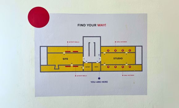
And yes, of course, there was a map!
Binding all the exhibits was a common design element—the red dot.
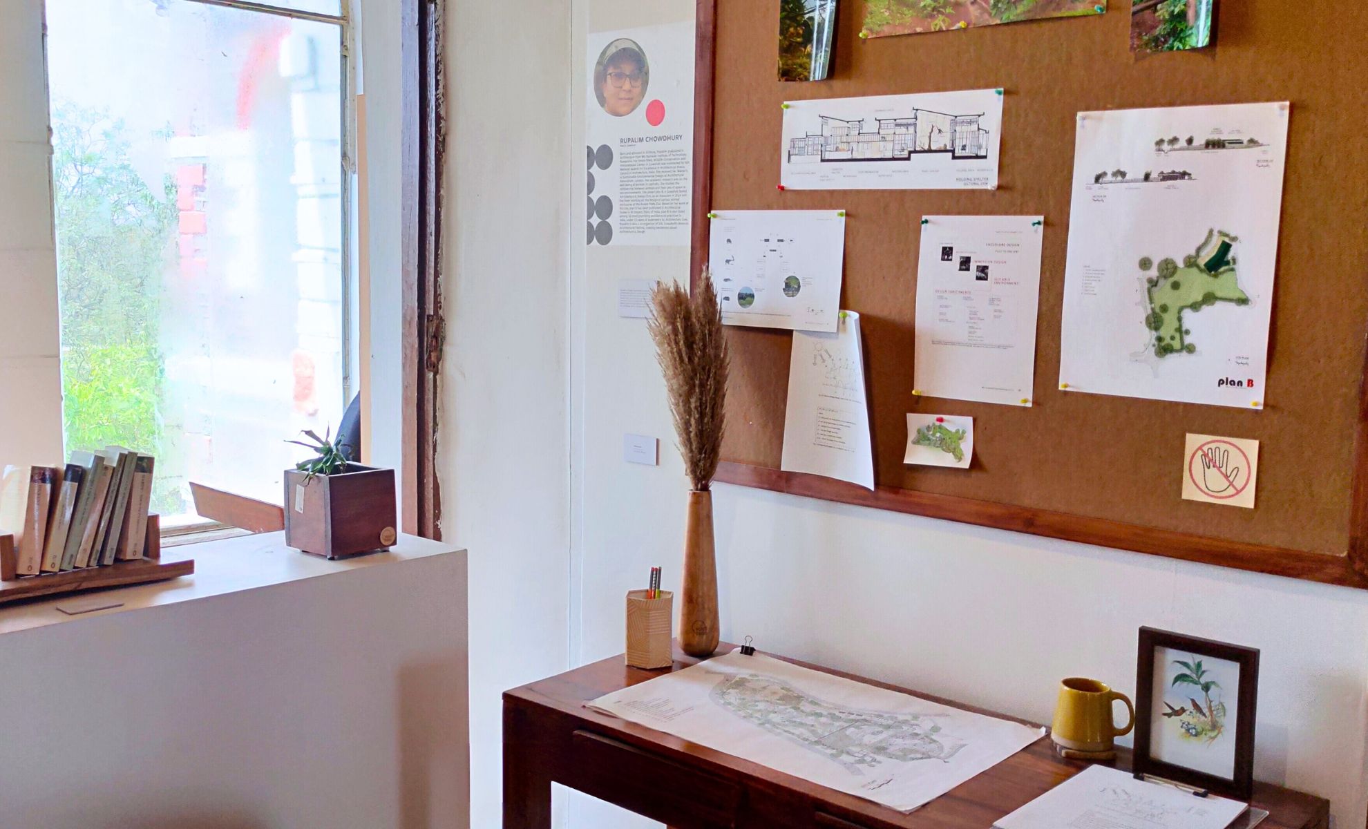
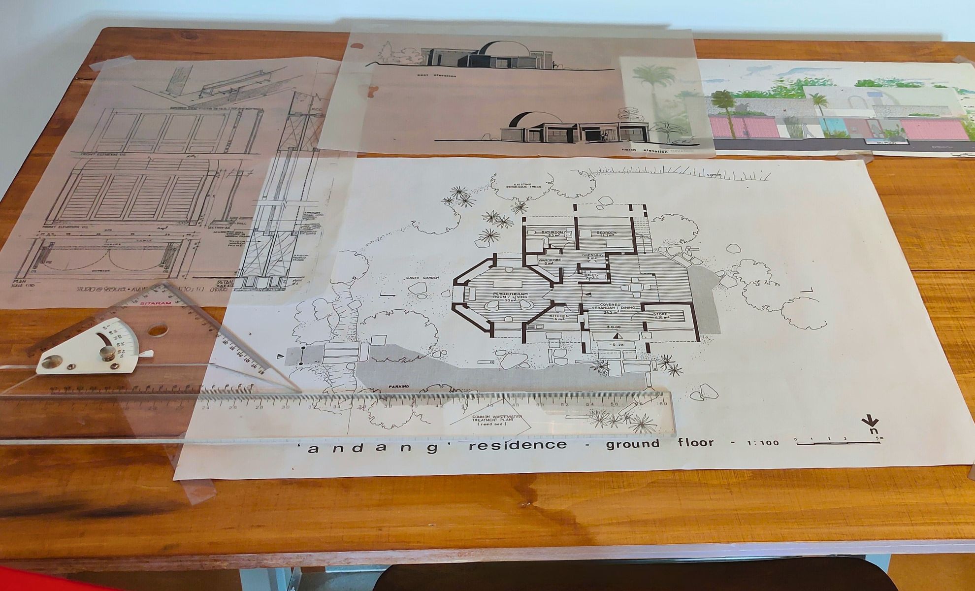
We saw aesthetically set up studio spaces with glimpses of architectural work-in-progress. Intentionally messy, but true to their word, stimulating.
Below are some pictures we saved for later.
Hopefully, one day we’ll have a space we can call our own—when we can finally free up some loft space and get rid of those packaging cartons. A time when we can drill nails into the walls and put up all our artwork (and the two guitars we now have).
Will we find these pictures when we need them? Only time will tell!
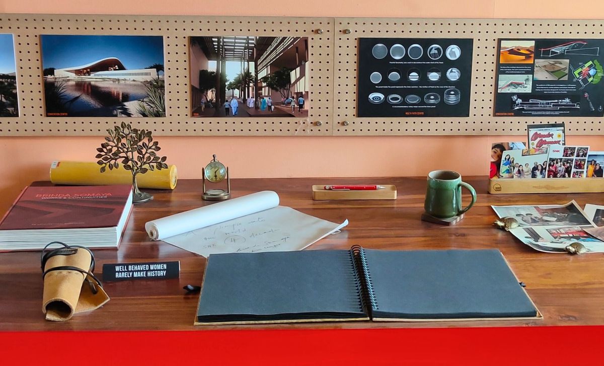
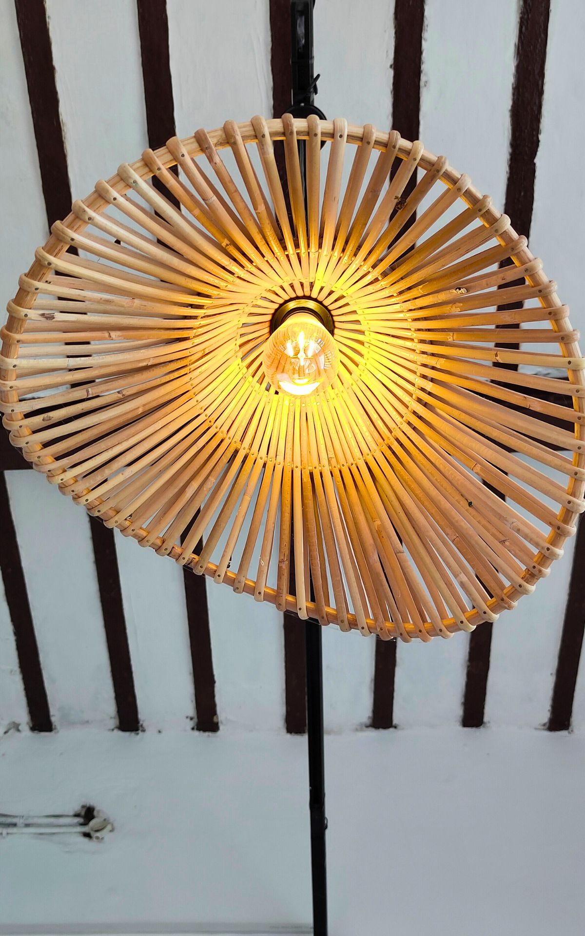
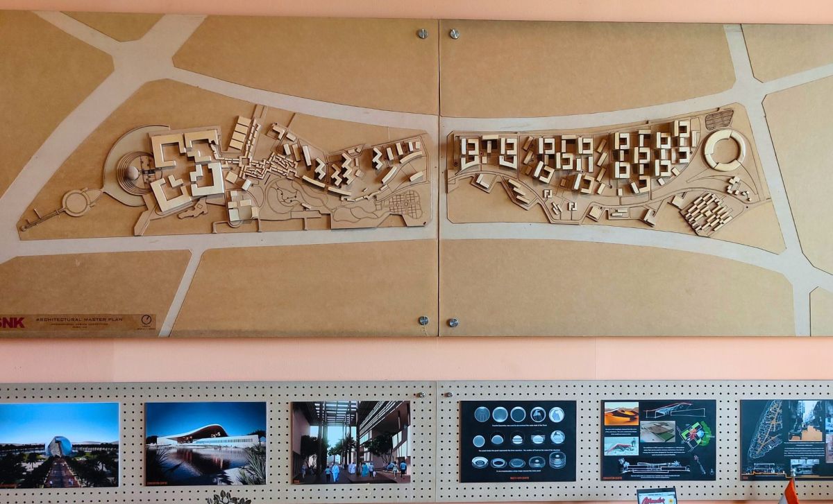
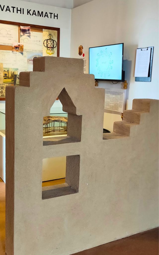
3D architectural site plan as a wall display from Somaya Sampat's Studio
For the past few years we’ve been looking to buy a home, and we’ve looked at numerous fancy flyers by builders. But nothing has ever caught our imagination. Year after year, all we’ve seen are towers of concrete, embellished with heat-trapping glass. These so-called modern constructions conveniently ignore the realities of climate change. The prospective home buyers are effectively going to live in ovens, necessitating the use of air conditioning, further compounding the problem.
We love open, airy spaces with ample natural light, and yet, these townships pack houses like sardines. Projects these days claim to include rainwater harvesting, just to hop on the green bandwagon. But few even venture close to recycling grey water from kitchen sinks. With every house invariably keeping RO water purifiers, it makes sense to collect the waste water from these appliances for sanitation use. There is also immense opportunity to use rooftops for solar energy. None of these ideas are earth-shattering. Indeed, many of them have been implemented in other parts of the country. But the big builders of Delhi-NCR seem to lack inspiration to truly innovate.
If only they’d hired (or taken inspiration from) the architects of the calibre featured in the Samatva pavilion of IAADB23.
The Sustainable Eco-Literate Architect
Revathi Kamath’s treatise on the sustainable eco-literate architect.
The pioneer of mud architecture, Revathi Kamath wrote in her treatise on the sustainable eco-literate architect:
The architectural mind needs to be aware of the mathematics of complexity and geometries of nature—Mandelbrot sets, Julia sets, Berkhoff’s bagel, Koch curves, Buddhist and Hindu Mandalas—the list is constantly growing. The immense beauty that is latent in the use of these conceptual tools needs to be appreciated and replace the simplistic dogmas of the “cleanlineists,” the functional packaging of commercial space in boxes, the squares and rectangles on Vaastu and Feng-Shui pandits, layouts of military camps and cantonments, imperial palaces, administrative centres and corporate parks.”
Humanity must seek inspiration from nature and build to sustain, instead of merely using and dumping resources indiscriminately.
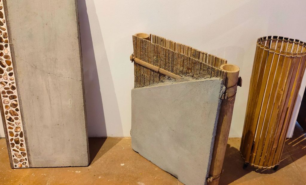
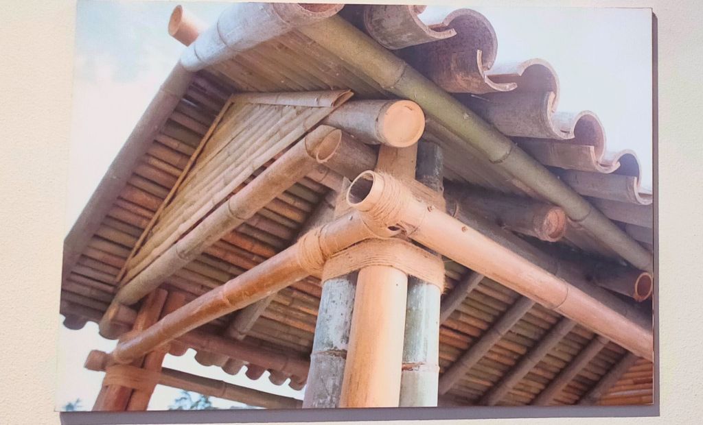
Take Kankana Narayan Dev, for example. Hailing from Assam, the architect takes inspiration from traditional, sustainable methods of construction in her work.
Furniture and building blocks that incorporate bamboo.One of Kangana’s homes made with bamboo.
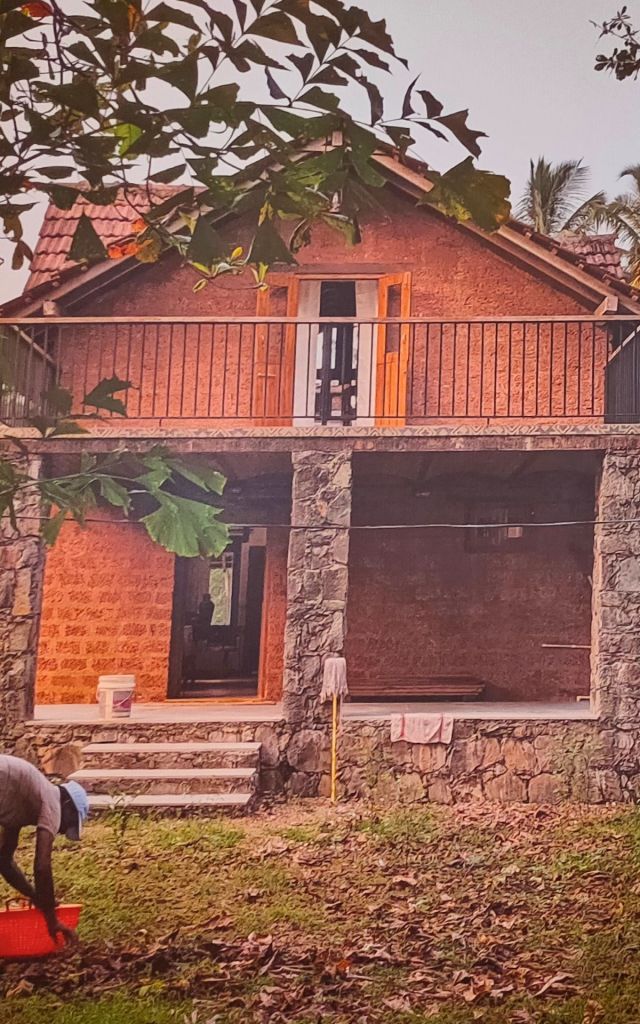
While Kankana works primarily with bamboo, Goa-based Tallulah D’Silva‘s material of choice is mud.
Tallulah D’Silva’s homestay that incorporates mud for constructionRevathi Kamath’s studio featuring a hand-crafted mud wall.
Sustainability wasn’t the only theme of Samatva. So was social inclusion and designing with empathy—something commercial builders could learn from.
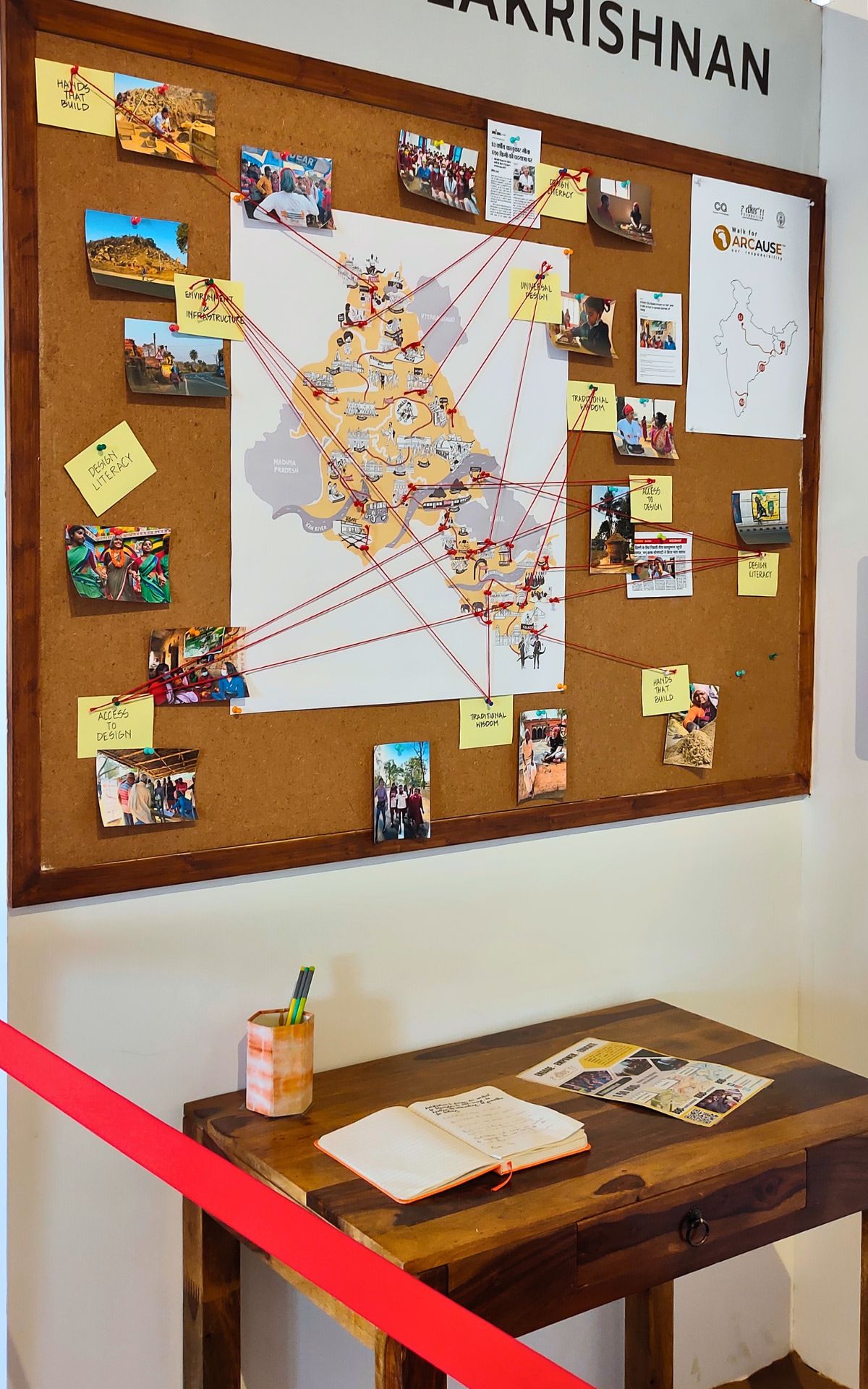
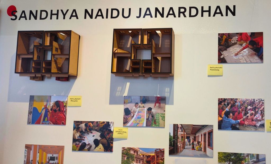
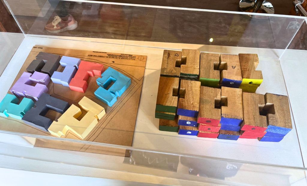
One project that caught my eye was Sandhya Naidu Janardhan’s slum redevelopment work.
Building With Empathy
Sandhya Naidu Janardhan’s design process while working on slum redevelopment.
While on our home hunting spree, we visited dozens of construction sites. We sat in lavish sales offices, browsed through glossy brochures, walked inside heavily decorated sample flats and watched the brokers point at realistic scaled model of the buildings. The sheer amount of marketing glitter around these projects was mind-boggling.
But when you’re redeveloping a slum, it’s not as glamourous. You likely won’t have access to the kinds of resources the builders have. It would have been easy for Sandhya to have just drawn some cookie-cutter plans and got them approved without anyone batting an eyelid. But she chose to involve the community in her design process. The hallmark of a good designer is to understand the needs of the user—in this case, the people who would eventually live in the spaces she’d design.
Low fidelity models made with paper and wooden blocks.
By far my favourite exhibit was the small models made with paper and wooden blocks. Proof that one doesn’t need fancy photorealistic models to communicate a vision. What is needed, though, is the willingness to perform sound user research.
Would any big construction company ever care for their customers as much? We’re yet to find one that does.
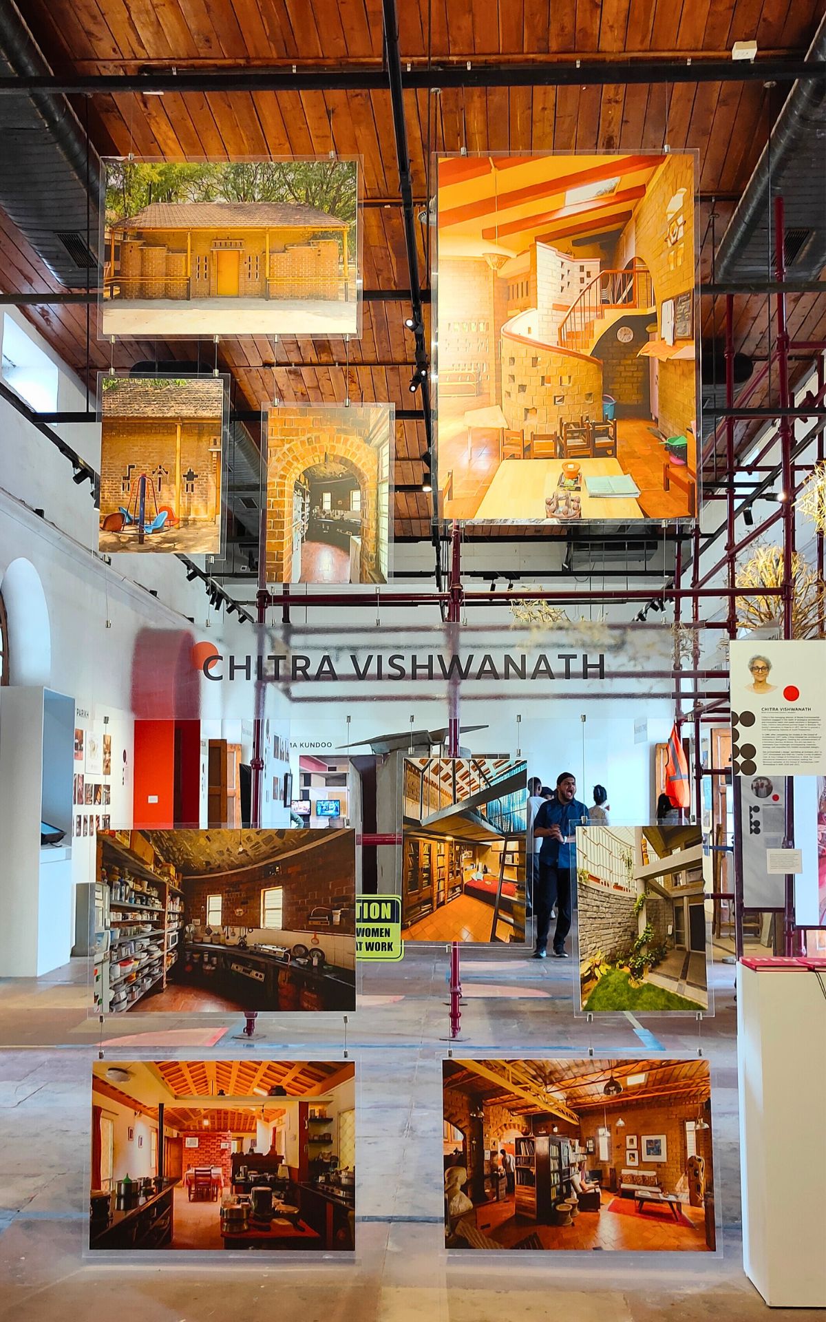
The image at the top is a display from Somaya Sampat, formerly Somaya & Kalappa Consultants (SNK), at the Samatva Pavilion of IAADB23.
India’s cultural history dates back to prehistoric days. Yet, when it comes to design, the world seems to consider Europe as the centre for excellence.
The India Art, Architecture and Design Biennale 2023 (IAADB23) was a welcome initiative by the Ministry of Culture to show the world (and more importantly, to Indians) what they’ve ignored (or perhaps wilfully tried to destroy, almost succeeding at it).
The initiative captured public imagination. From quirky installations to mind-blowing paintings, and from replicas of temples to modern art, there was something for everyone.
The Red Fort, with its sprawling lawns and numerous barracks was an appropriate choice. To house the cultural history of a nation as rich and diverse as Bhaarat, would have taken nothing short of a small army.
The entire showcase was divided into seven pavilions, each with appropriately beautiful names:
Pravesh (Doors of India), Rite of Passage.
Bagh-e-Bahar (Gardens of India), Gardens as universe.
Sampravah (Baolis of India), Confluence of Communities.
Sthapatya (Temples of India), Antifragile Alogrithm.
Vismaya (Architectural Wonders of Independent India), Creative Crossovers.
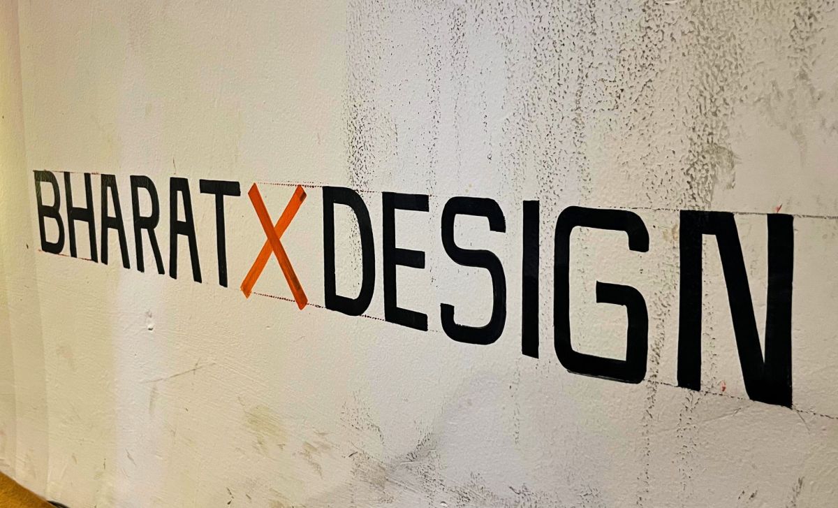
Deshaj (Indigenous Design), Bharat x Design.
Samatva (Women in Architecture and Design), Shaping the Built.
While the installations at Vismaya and Pravesh made it to Instagram reels, Deshaj was the one that I was looking forward to. But the pavilion that ultimately had the biggest impact on me was Samatva.
Samatva: Shaping the Built
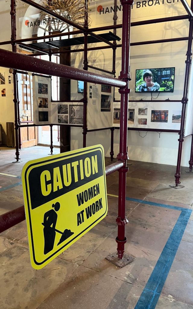
Inside the Smartva pavilion, a signboard reads, “Caution: Women at Work.”
Curator Swati Janu introduced Samatva thus:
The root of the word Samatva (Sanskrit: समत्व) is sama (सम) meaning ‘equal’ which forms the essence of this exhibition and the reason why we showcase women architects here.
Historically and even today women have not been given the same opportunities and recognition as men in the fields of design, architecture and planning, be it in pursuing the profession or being widely published or invited to speak at panels.
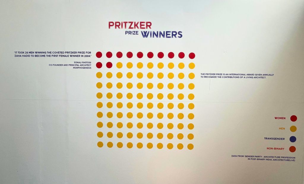
Even before we entered the pavilion, we saw these graphics reminding us about the poor representation of women in architecture.
The information visualisation nerd in me, however, couldn’t help but appreciate how beautifully well the information was presented. Using nothing but coloured dots, the series of graphics showed the gap in gender participation in architecture. Yellow dots represented men, while red ones represented women. The saddest visualisation was entirely yellow.
Since 1972, there hasn’t been a single non-male president of Council of Architecture.
As architect Amrita Nayak puts it, “Often women have to work harder to be ‘listened to’ by senior leadership, in comparison to men with similar expertise or experience.”
I have been fortunate to have been heard in my work environment. But Amrita’s experience is all too familiar in a social setting.
The picture gets somewhat better when it comes to recognition of women in architecture, with 12 red dots against 88 yellow ones. The Pritzker Prize is an international award given annually to recognise the contributions of a living architect.
“It took 26 men winning the coveted Pritzker Prize for Zaha Hadid to become the first female winner in 2004.” – Sonali Rastogi, Co-Founder and Principal Architect, Morphogenesis
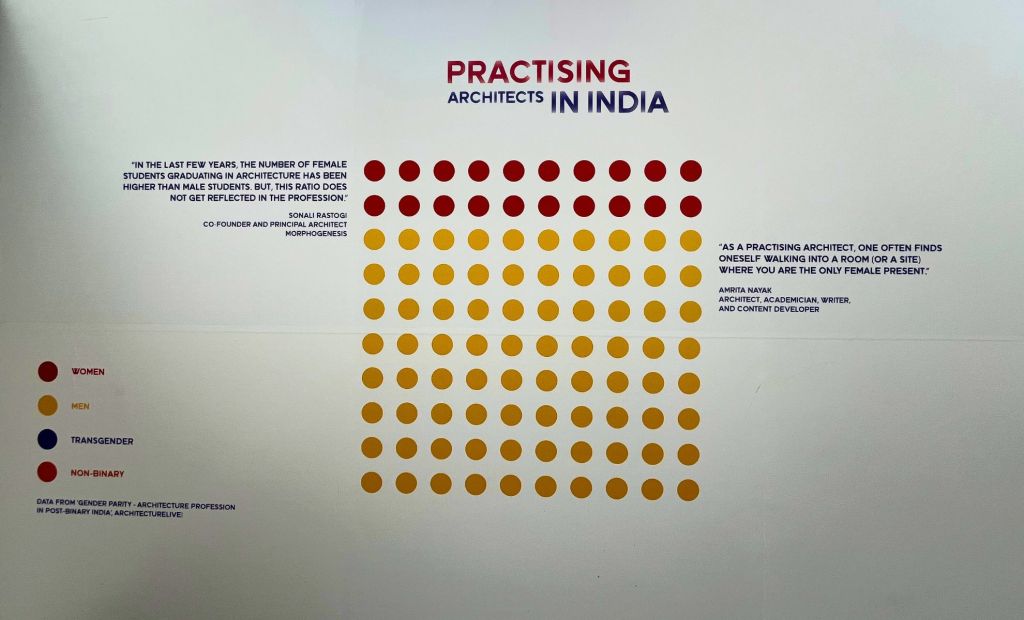
One reason why so few women have been awarded the prize is because there are fewer women who practice. 20 red dots to 80 yellow ones.
Beside the visual, another eerily relatable observation by Amrita reads, “As a practising architect, one often finds oneself walking into a room (or a site) where you are the only female present.”
“As architects, we are meant to build inclusive spaces. Why did we not make an inclusive framework for society?”
– Jaya Nila, Architect and Founder, The Architecture Place, Bengaluru
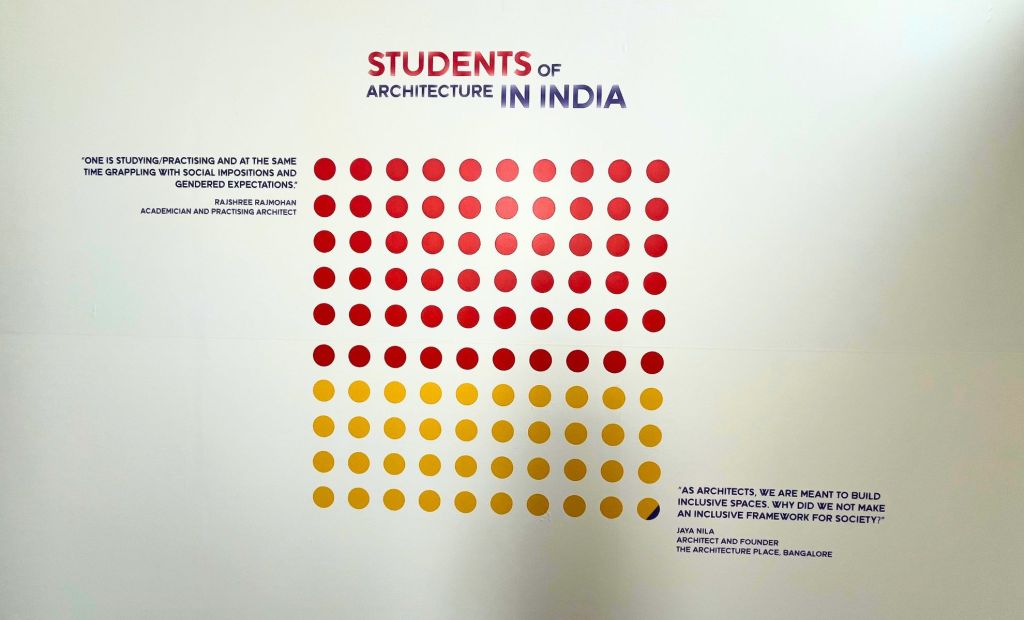
Amongst this sea of yellow dots, one visual represents hope. On the graphic for the number of students of architecture in India, the sixty red dots outnumber the yellow ones—a fraction short of forty. A tiny fraction of blue comes in too, to represent the transgender section of society.
However, as academician and architect Rajshree Rajmohan points out, “One is studying/practising and at the same time grappling with social impositions and gendered expectations.”
Equanimity is a concept that is rooted in Indian culture, but centuries of colonialism slowly eroded it. But hope springs eternal, and there are some signs of revival. We have a long way to go to rediscover our roots and I hope initiatives like IAADB don’t get restricted to quirky social media shorts but spark genuine conversations around design in Bhaarat.
This is the first of what will likely be a long series of posts dedicated to IAADB23, as I have just stumbled upon the treasure of memories in my digital archives. Stay tuned for more!
Sometimes we fail to see things that are right in front of us. And it took me four days of looking around and racking my head, to see the obvious.
Be it the drafting paper or the guides of a digital tool, the grid is an important part of a designer’s work.
After I finished kicking myself for failing to realize this, I began seeing grids everywhere. The mosaic on the building’s wall, the tiles on our balcony floor, the chessboard inside the attic, the flannel of a train passenger, the gate of my office, the pattern book for cross stitching, the visible and imaginary separators in the drawer…
I realized that the grid is not just a tool for a designer, it is design — working for us without drawing attention to itself — hidden in plain sight.
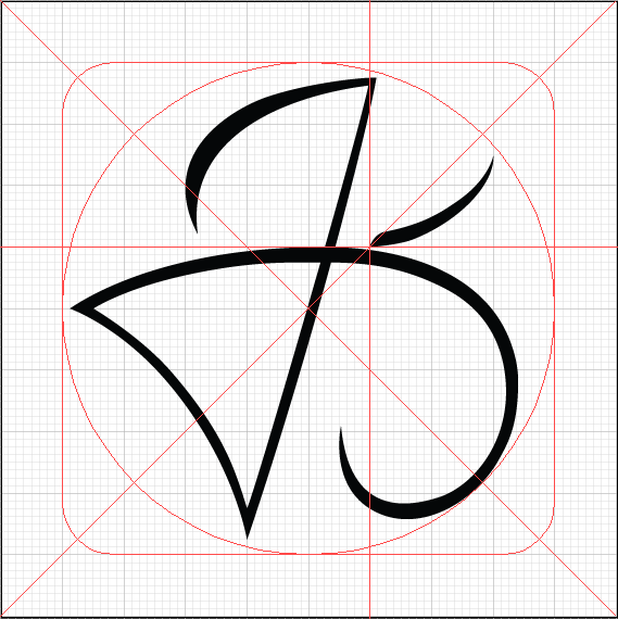
This is a screen grab of the logo I created some time ago for a t-shirt ‘brand’ I tried to create*. It is the letter ‘ka’ written in four languages — Tamil, Hindi, English and Bengali (the last one being accidental!)
For other interpretations, be sure to check out this week’s photo challenge by The Daily Post : Grid
* I documented the experience of selling the t-shirts earlier this month. Check it out on Medium: A Semi-Formal Product Audit
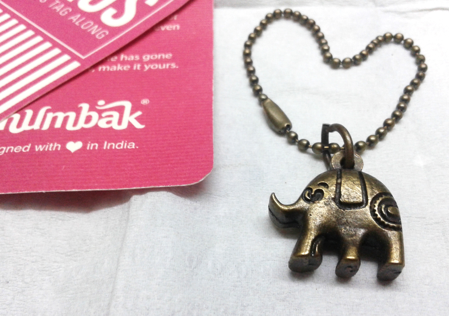
A baby elephant, proudly saying 'designed with love in India'!
A couple of weeks back, I ordered a bag from the online store Chumbak*
The bag was of very good quality, no doubt, but what I liked more were the little bits of detail in the product package — the bright pink tags on the bag; the caption that said ‘Designed with love in India’; and my favourite, the metallic baby elephant!
A symbol of my love for textured paper; a symbol of national pride; and a symbol of the joys of little surprises.
Kudos to the team at the store for putting their heart into the purchase experience!
A baby elephant, proudly saying ‘designed with love in India’!
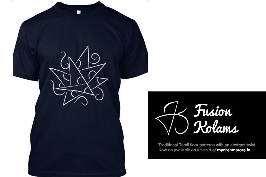
In other marketing news, here’s something I recently created — a t-shirt of my mother’s kolam!
T-shirt available now at mydreamstore.in
This is the first of what I hope will become a series of tees – see, there’s a logo too! 😀
I’m still figuring out how to go about all this, and I need your help to make it successful. I’d really appreciate if you would share this with anyone who’d be interested in buying it 🙂
If you’d like to purchase it, it is available here and here.
To see other symbols and their interpretations, be sure to check out the Daily Post’s Weekly Photo Challenge
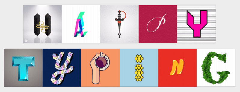
Many years ago, I saw a movie in which the villain had written a ransom note using letters cut out from different newspapers. For something as evil as what the note said, it sure looked interesting! I am not sure if I tried to do something like that for myself — if I did, it was most likely a terrible failure. But buried somewhere in the deep recesses of my sub conscious brain, was this fascination for mismatched type and lettering.
Today, as I was catching up on email, I discovered this simple, yet wonderful site that turns text into random images. I freaked out. For the next several minutes I typed happily and watched them magically turn into fun image collages. As one reviewer, Keren Phillips, noted “I feel like I’ve been waiting for this FOREVER, I just didn’t know it.”
A little while later, this is what decorated my desktop:
The letters in these images are actual illustrations/photographs posted on Instagram. The images are copyrighted, and the collages can be used only for personal purposes. Check it out at Type to Design and have fun! (works only on desktop) A shout out to Product Hunt, through which I found out about this fun app.
And yes, I typed out my name as well 🙂 Typing into the narcissist in me, perhaps?
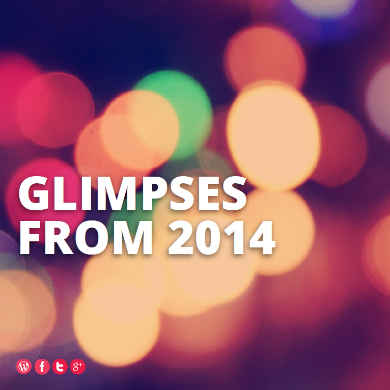
Every year, our newspaper brings out a compilation of the major events of 2014 in the form of a supplement. It makes for an interesting read, and I quite look forward to it. This past month though, I decided to try out my own abridged version of the round-up.
This compilation was part of the monthly newsletter which is mailed to the members of my college’s Alumni Association. I quite enjoyed creating this, and am quite happy with the way it came out. I hope you enjoy it, as much as I enjoyed making it.
The entire compilation, with a full credit list can be viewed and downloaded in a printable PDF format here: Glimpses from 2014 .
This slideshow requires JavaScript.
The file is 1.7 MB, which may, or may not be heavy for you. In case you decide to print it, I’d love to see how it looks! And of course, you are free to share it. After all, sharing is the best form of flattery 😉
A little while back, I visited the food court at HUDA City Centre Metro Station.
Now I’m not very fond of fancy restaurants. I usually end up buying corn on the cob from a street vendor. But when my stomach groaned, I reluctantly entered the newly opened food court.
It didn’t take long for me to get a snack. A keen eye behind the counter of petooz noticed a hungry customer and helped me decide my order. But more than the snack (which was delicious), I liked the colourful illustration on the wall of the street food stall.
The doors of public transport?
Detail of the illustration
The snack bar
A hat-tip to the artist Arif Hussain. From the Red Fort and Qutab Minar to a foul mouthed auto-rickshaw* driver and the Metro line, the illustration captures the big landmarks and the quirks of New Delhi. If you happen to find yourself at the HUDA City Centre Metro station, be sure to check out the food court, whether you are hungry or not.
More photographs at Sasi Menon Design’s FaceBook Page:
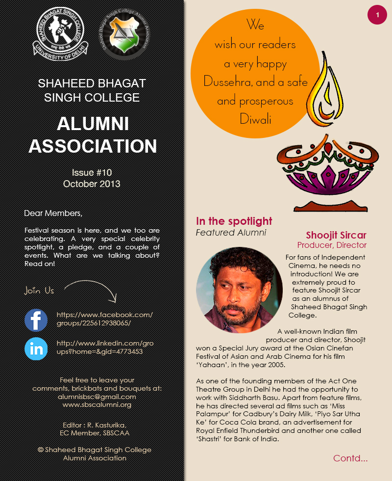
As the last few hours bring the curtains down on the year, here’s the last in the series of my recap of the year. Like the previous two posts in this series, this one too will focus on my work with the Alumni Association.
Designing for specific events allowed me to satisfy my creative hunger. But it was the newsletters, which really challenged me. We had to deliver an issue every month, and there were many months when we didn’t make it in time. The design had its teething problems, and there were some months when we were struggling for content.
Eventually though, we managed to get the content and design in order. And it took no less than nine months of experimenting with the layout and features.
Of the twelve issues we pulled this year, October was the blockbuster of the year (at least for me). I had the most fun working on this one – I got the chance to play the designer, illustrator, content writer, as well as the editor – and we sent it on time!
So here it is, in all its glory – Issue #10. I hope you like it as much as I do.
With best wishes for a happy and prosperous New Year, thank you for sticking around 🙂 See you in 2014!
As we count down to the new year, I recap the year almost gone by.
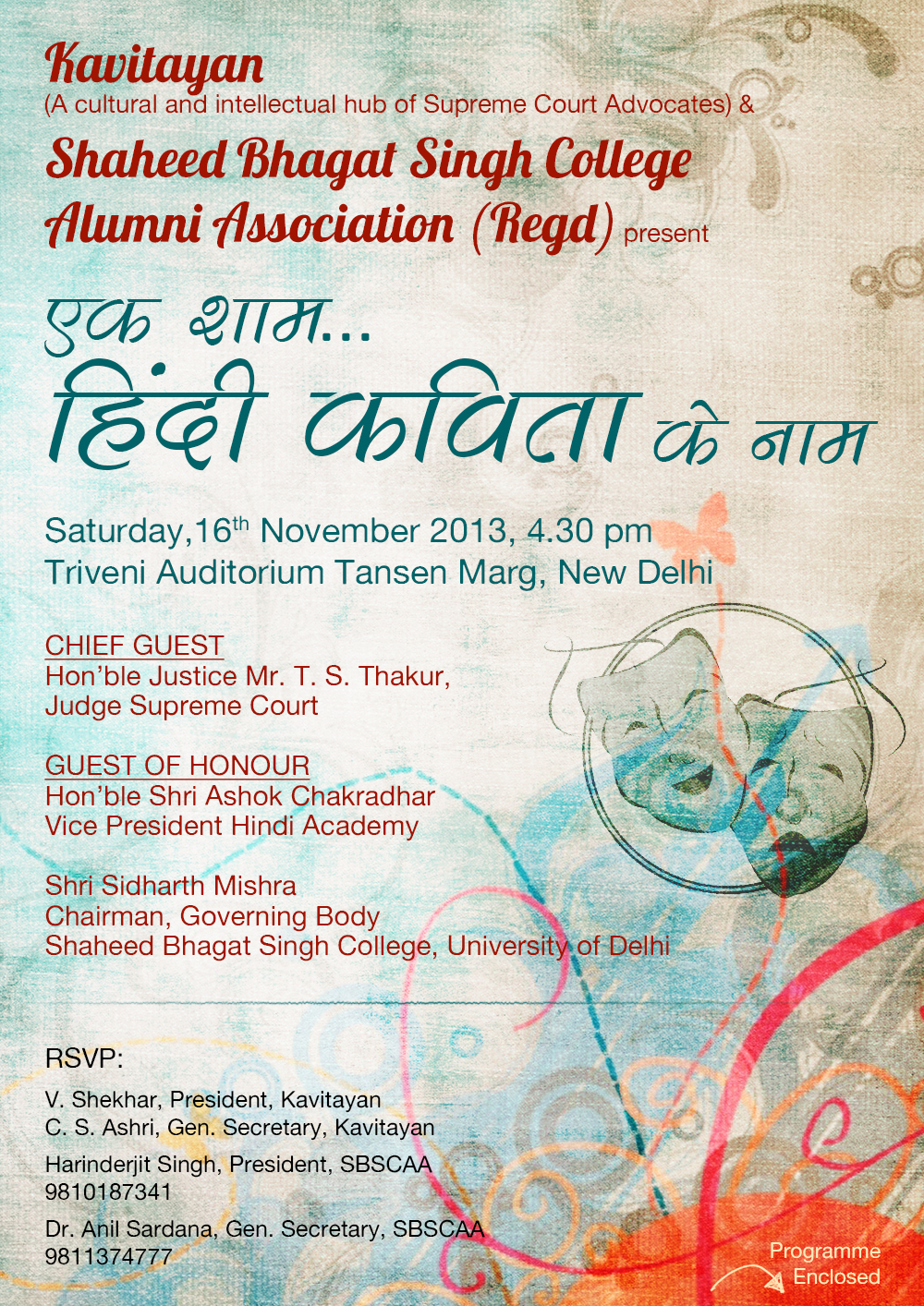
Being a member of the Alumni Association of my college, I had a lot of design work on my plate. The last post covered posters from the year. In this post, a couple of e-invitations I designed for the events organised by the Association.